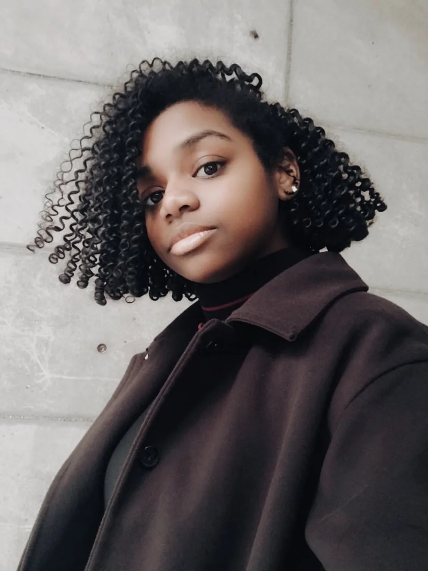





10+ years designing and shipping products across AAA games, enterprise software, and healthcare. Amazon L5. Rockstar Games. Mayo Clinic. Xbox. I bring design thinking and engineering fluency to every problem.
I found my way into design through games, then built a career at the intersection of UX/UI, development, and product leadership. I design systems that work under pressure for players mid-session, patients mid-crisis, and employees mid-review-cycle.
I've partnered with teams at Amazon, Mayo Clinic, Rockstar Games, Epic Games, and Los Alamos National Laboratory. I lead cross-functional work that improves usability, adoption, and delivery speed then ship it.
Currently a PMP candidate at Capella University, deepening the strategy side to complement the execution. Remote-only. Open to international. Looking for senior IC or lead roles where design decisions actually matter.
Figma
Unity
Unreal
React
HTML/CSS
JavaScript
C#
C++
Python
iOS
Android
Jira
Experience
10+ Years
Education
Capella University B.B. Project Management
Cert
PMP Candidate
Industries
Gaming · Healthcare · Enterprise · Gov
Location
Madison, AL (Remote)
Contact
angela.b.clemons@gmail.com
Major Projects
The work that defines me.
Seven projects across four industries: six shipped, one in soft launch. Each one had real stakes, real users, and real constraints. Click any card to view the full case study.
Senior IC or lead roles, remote-only, open to international. If you're working on something that needs both design thinking and engineering fluency, let's talk.
The complete visual language, component library, and design tokens powering angelaclemonsux.com. Built with Syne + DM Sans, a deep navy/blue/teal palette, and precision spacing.
Deep navy foundation with a blue/teal primary pair and an amber split-complement. Dark backgrounds dominate; light sections use ghost white.
Core Palette
Every swatch tested against the three text colors we actually use (white, our mid gray, and near-black ink) at the WCAG AA threshold for normal text (4.5:1).
White19.34:1 · Pass
Gray4.48:1 · Fail
Black1.00:1 · Fail
Ink
#0a0e14
Primary background
White4.10:1 · Fail
Gray1.05:1 · Fail
Black4.72:1 · Pass
Brand Blue
#2a82c8
CTAs, links, accents
White3.31:1 · Fail
Gray1.30:1 · Fail
Black5.84:1 · Pass
Teal
#1e9e8e
Secondary CTAs, tags
White2.22:1 · Fail
Gray1.95:1 · Fail
Black8.73:1 · Pass
Amber Gold
#e8a020
Archive labels, max 1/section
White1.11:1 · Fail
Gray3.88:1 · Fail
Black17.39:1 · Pass
Ghost White
#f0f3f8
Light section backgrounds
Tints + Neutrals
White15.70:1 · Pass
Gray3.64:1 · Fail
Black1.23:1 · Fail
Ink 2
#1c2333
Cards on dark bg
White1.13:1 · Fail
Gray3.81:1 · Fail
Black17.07:1 · Pass
Blue Pale
#e8f2fc
Skill chips, tints
White1.13:1 · Fail
Gray3.83:1 · Fail
Black17.18:1 · Pass
Teal Pale
#e4f5f3
Tags, hover fills
White4.31:1 · Fail
Gray1.00:1 · Fail
Black4.48:1 · Fail
Mid
#6b7a99
Meta text, labels
White2.09:1 · Fail
Gray2.07:1 · Fail
Black9.27:1 · Pass
Lite
#a8b4cc
Body on dark backgrounds
Contrast Combinations
Blue on Ink
Hero headlines, nav states
White on Blue
Primary CTAs and buttons
Ink on Ghost
Project cards, about section
Blue-D on Blue-Pale
Skill chips, badges
Teal on Ink2
Section labels on dark
Teal-D on Teal-Pale
Teal variant chips
02
Project Accent Colors
Each case study gets one muted accent color, restricted to its badge label and hover border only. Never the card fill, skill chips, or CTA button. Color signals identity without competing for attention.
Mayo Clinic
#1a7cc2
Amazon
#e47c1a
RDR2
#b02a2a
Fortnite
#7c3aed
Mythic Merchants
#c47a1a
Box Buddy
#1e9e8e
Mass Virtual
#007a8a
Xbox / Trivia
#107c10
03
Typography
Syne for all display, heading, and UI label work. DM Sans for all body copy. JetBrains Mono for code and hex values only.
Syne Display + Headings
Display · 800 · clamp(3–4.8rem)
Angela.
H1 · 800 · 2rem
Senior UX/UI Designer
H2 · 800 · 1.5rem
Major Projects
H3 · 700 · 1.1rem
Mayo Clinic
DM Sans Body + UI
Body · 400 · .95rem · lh 1.8
10+ years designing and shipping products across AAA games, enterprise software, and healthcare.
Small · 400 · .82rem
Patient Portal UX · WCAG 2.1 AA
Label · 700 · .62rem · uppercase · tracking .22em
About
JetBrains Mono · .72rem
#2a82c8 · --blue · var(--blue)
04
Buttons + Interactive Elements
All interactive elements use Syne. Hover states always include translateY(-2px). Pill radius for nav and tags only.
Project cards share one neutral background and skill-chip style across all eight. Only the badge label and hover border carry each project's accent. Other Work cards sit on dark, subtle border. Both use 12px radius and lift + shadow on hover.
Project Cards (hover to see accent border)
Healthcare
Mayo Clinic
Senior Digital Designer
Enterprise
Amazon
L5 UX/UI Designer
AAA Games
Fortnite
Player Experience · Epic Games
Other Work Cards (dark context)
Los Alamos
Data Visualizer
3-GIS
Skill Builder Prototype
In Progress
More Coming Soon
06
Spacing + Border Radius
8-point base grid. All spacing is a multiple of 4px. Sections use 96–100px vertical padding on desktop, 64px on mobile.
Spacing Scale
4pxTight, icon gaps
8pxSmall, chip padding
12pxButton padding, vertical
16pxCard padding
24pxGrid gaps
32pxSection padding
48pxSection gaps
64pxHero padding
96pxSection rhythm
Border Radius
4px
CTAs
8px
Chips
12px
Cards
20px
Modals
pill
Tags
07
Motion + Animation
0.2s for micro-interactions, 0.4–0.6s for scroll reveals. One animated background per section max. No bounces.
55 pts, 0.25px/frame, connected under 120px. About section only, the only animated background on the site.
Decorative glow blobs behind the hero and contact section were removed. They carried no meaning and competed with content. Motion now earns its place only where it responds to something.
08
Navigation
Fixed, 60px, dark glass. Logo left, links center, resume pill right. Custom cursor activates on all link hovers. All 8 case study pages reuse this exact structure, restyled in their own project colors.
Angela.
AboutWorkOtherContactSystem
Resume
09
Best Practices
Rules enforced across the portfolio for visual consistency and performance.
✓ Do
Use Syne 800 for all headings and display text
Use DM Sans for all body copy and descriptions
Restrict a project's accent color to its badge + hover border
Keep animated backgrounds to one per section max
Use 4px radius for buttons, full pill (99px) for tags
Always include translateY(-2px) on button hover
Use fade-up + IntersectionObserver for all reveals
Maintain 96px section padding on desktop
✕ Don't
Don't mix project accent colors across cards
Don't use Inter, Roboto, or system font stacks
Don't use more than one amber element per section
Don't add particle canvas to more than one section
Don't use border-radius pill on dark primary CTAs
Don't use decorative motion that isn't tied to interaction
Don't add box-shadow without a hover state trigger
Don't change max-width:1120px on the wrap class
10
CSS Design Tokens
The exact custom properties defined on :root in production, not a rounded-off summary. Spacing and radius are used consistently in code but kept as plain px values rather than tokens.