Case Study · Amazon

Making the path to
promotion visible.

Amazon's promotion process was opaque. We built a career development LMS that gave employees, managers, and HR a shared source of truth, for the first time.

Role L5 UX/UI Designer
Company Amazon Internal Creative Services
Timeline Nov 2021 – Mar 2023
Platform Web · Android · iOS
Tools Figma · FigJam · Jira
Colleagues collaborating over laptops, mid-conversation
Process on this project See how I work, in full →
  1. 01Ideation Framed it as three audiences instead of one, and argued the employee-sees-it-first rule before any UI existed.
  2. 02Research Three user types, each with a different relationship to the same promotion data.
  3. 03Design Four screens spanning the employee, manager and leadership flows.
  4. 04Testing Ran, same as anywhere else. The findings belong to Amazon, so they are not mine to publish.
  5. 05Iteration Driven by research findings rather than visible screen versions, so what changed was the model underneath, not the pixels.
  6. 06Implementation Carried into the build, front end included. I wrote code on this one.

Amazon's promotion process was a black box.

The difference between L4 and L5, or L5 and L6, is a real jump in compensation, scope, and career trajectory. But for most employees, the path to promotion was opaque. Managers described expectations differently. Required competencies weren't standardized. Employees didn't know what "ready" actually looked like until they were told they weren't there yet.

Employees had no visibility into what specific competencies they needed to demonstrate to reach the next level.

Managers described promotion criteria inconsistently across teams, creating inequity in the process.

HR had no aggregate view of promotion pipeline health. Calibration sessions were manual and time-consuming.

There was no single platform connecting learning, feedback, assessments, and promotion readiness in one place.

Three users. Three definitions of success.

The most critical early insight was that each user type had a fundamentally different relationship with the same data. We designed three distinct experiences on one unified platform.

Employee · L4 / L5
Individual Contributor
  • "What do I need to do to get promoted?"
  • Needs clarity on competency gaps
  • Wants to see progress over time
  • Anxiety about being compared to peers
  • Needs guidance, not just information
Manager · L5 / L6
People Manager
  • "How ready is my team for promotion cycles?"
  • Needs to track multiple employees at once
  • Wants to flag who needs coaching
  • Needs to document evidence for HR reviews
  • Time-constrained, needs fast scanning
HR / Leadership · L6+
Senior Leadership
  • "Is the promotion pipeline healthy?"
  • Needs org-wide aggregate views
  • Wants to identify systemic gaps
  • Needs data for calibration sessions
  • Cares about equity and consistency

Designed across three user flows.

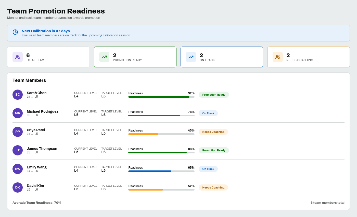
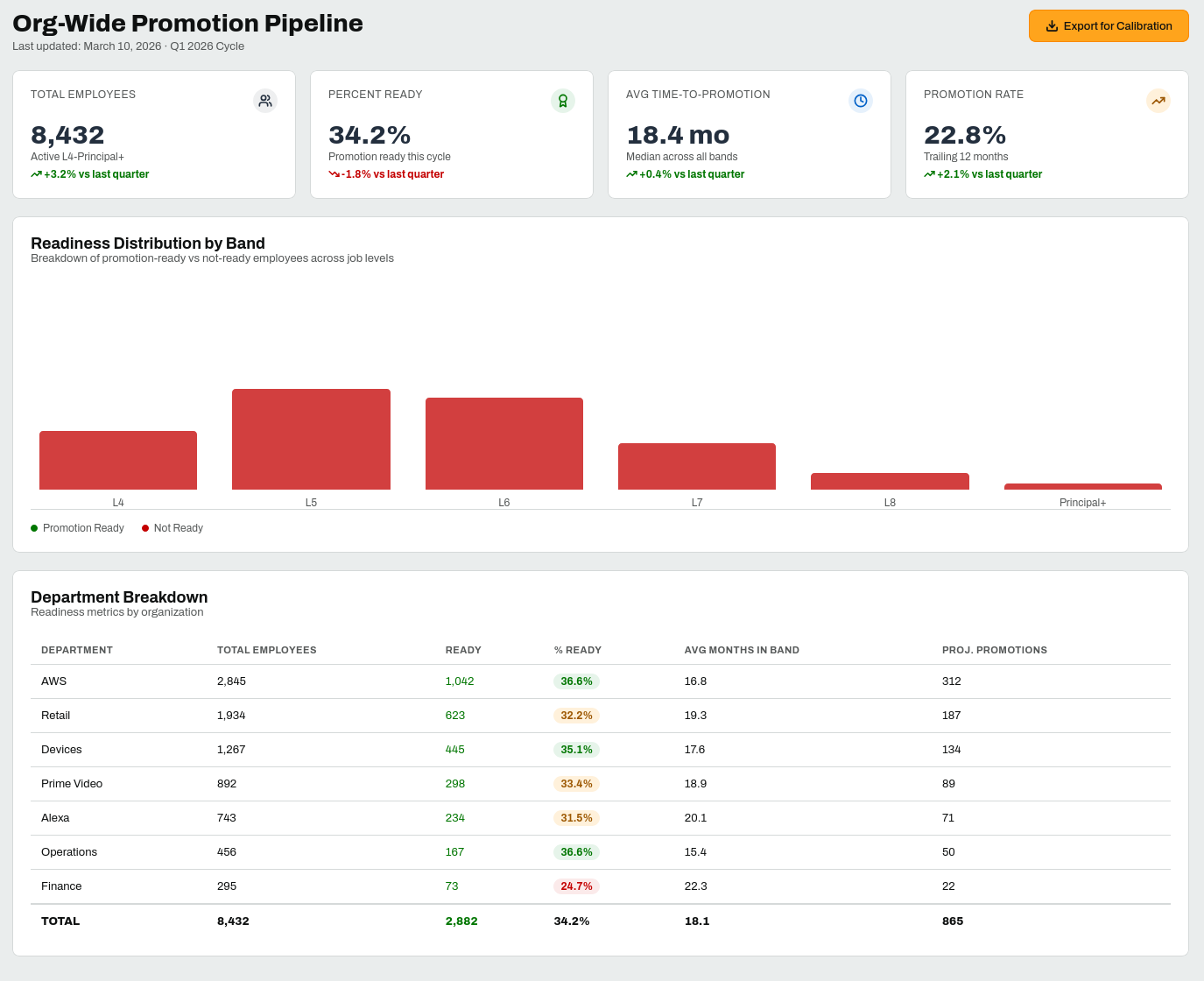
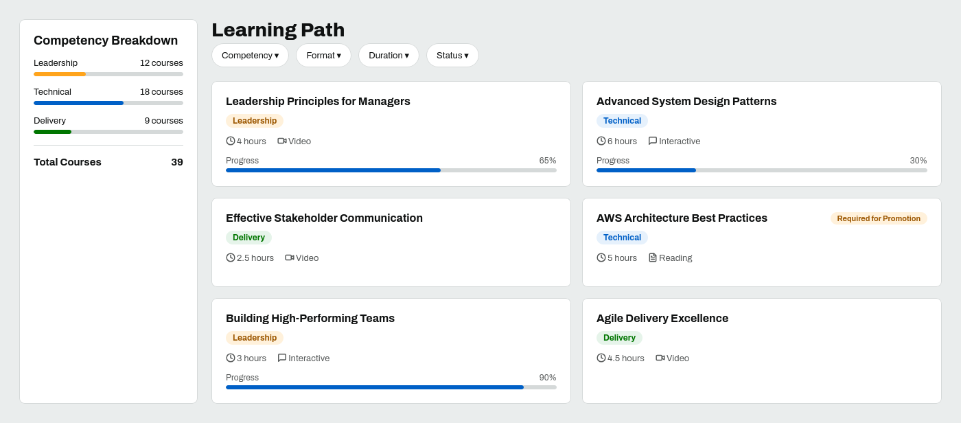
Four screens spanning employee, manager, and HR experiences, designed across three distinct user flows.
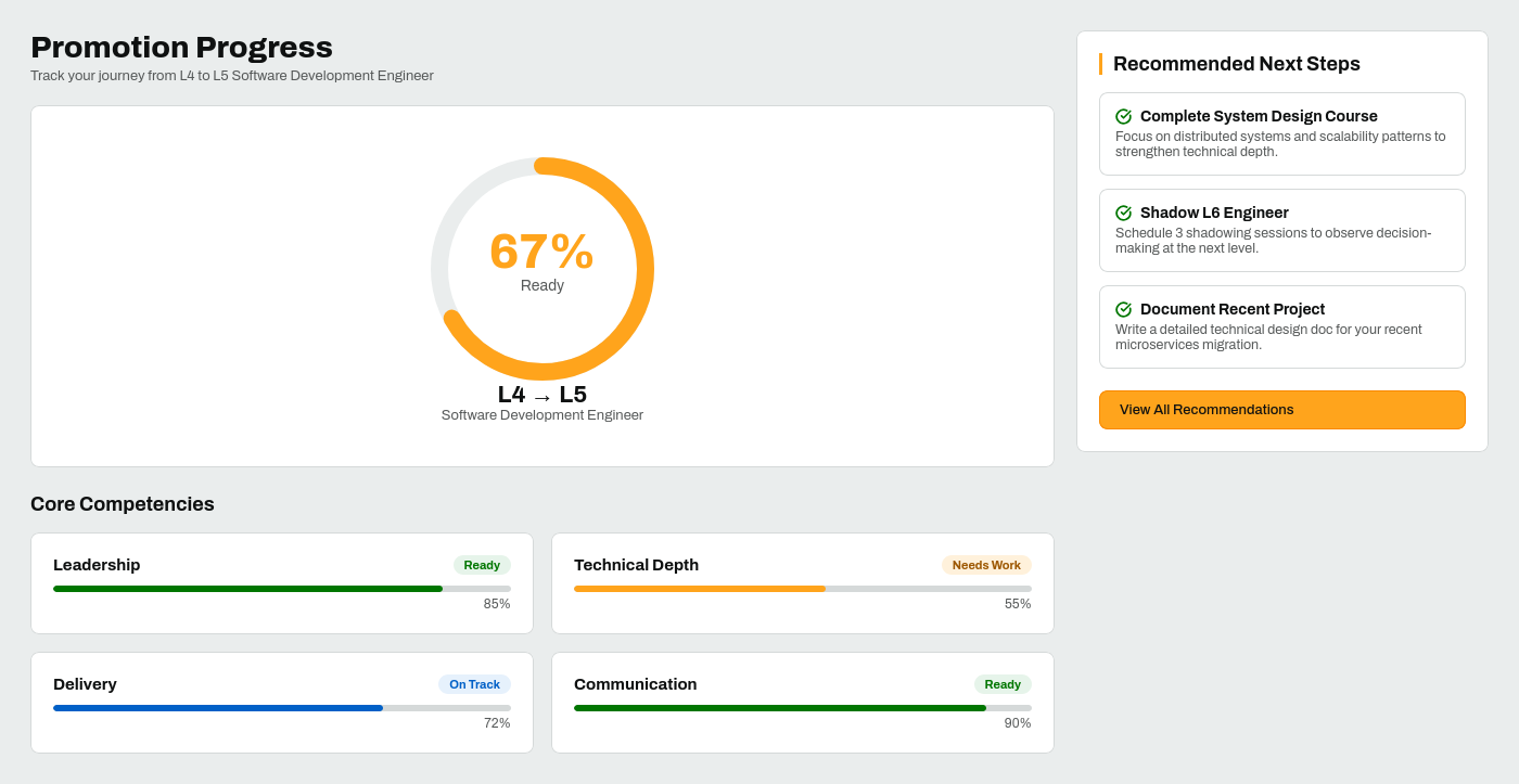
Promotion Pathway Dashboard screen
Employee Flow
Promotion Pathway Dashboard
Readiness ring, competency progress cards, and recommended next steps, all in one view.
Learning Path: Course Catalog screen
Employee Flow
Learning Path: Course Catalog
Courses mapped directly to L-level competencies, with required-for-promotion badges and filters.
Team Promotion Dashboard screen
Manager Flow
Team Promotion Dashboard
Scannable team readiness overview with status chips, coaching flags, and calibration countdown.
Org-Wide Analytics Dashboard screen
HR / Leadership Flow
Org-Wide Analytics Dashboard
Pipeline health metrics, equity filters, and calibration export, designed for senior leadership.

Measurable impact at launch.

Results measured at 90 days post-launch against pre-launch baseline across Amazon Creative Services.

+40%
Platform Adoption
vs. pre-launch baseline
↗ Trending up
−15%
Support Tickets
post-launch, first quarter
↘ Trending down
100+
Hours Saved / Mo.
process and wiki restructuring, a separate project in the same studio

What this project taught me.

"The most important conversation I had on this project wasn't about UI. It was convincing stakeholders that employees needed to see their own data before managers did."

Designing for high-stakes decisions requires extra care around information hierarchy. When data directly affects someone's promotion and compensation, every label carries weight. The manager/employee visibility boundary was the hardest UX problem on the project. Getting it wrong would have destroyed trust in the entire system.

Internal Creative Services was a studio, several designers and artists in one group, so I spent a lot of time advocating for decisions in rooms full of PMs and engineers who moved fast. Inside that studio I also ran solo projects, this one included, where the calls were mine from framing through to build. The two modes teach different things. Alignment turns out to be a design artifact in its own right, and you only really learn that in the first mode.