Case Study · Healthcare UX · 2025
Patient & Provider
Portal
Redesigning a healthcare platform that serves millions of patients. Where clarity isn’t a nice-to-have, it’s a clinical necessity.

Redesigning a healthcare platform that serves millions of patients. Where clarity isn’t a nice-to-have, it’s a clinical necessity.
Mayo Clinic’s patient-facing platform serves millions of users navigating some of the most stressful moments of their lives: managing diagnoses, tracking lab results, coordinating care across multiple specialists.
The existing portal had grown organically over years, resulting in fragmented navigation, inconsistent visual language, and an experience that required too much cognitive load from people who were already overwhelmed.
On the provider side, physicians were working from a portal that didn’t reflect their actual clinical workflows. Ordering labs, reviewing patient queues, and messaging patients required too many context switches.
Patients managing serious diagnoses were forced to navigate complex, jargon-heavy interfaces with no plain-language support.
The portal had grown organically: no consistent information architecture, no unified design language across features.
Physicians needed a dense, efficient workflow tool. The existing portal treated providers like patients. Wrong mental model entirely.
A healthcare platform with millions of users, many with disabilities, had no consistent WCAG compliance across its components.
A patient seeing a lab result and a physician ordering that same test are looking at identical data from completely opposite emotional and professional contexts.


Patient and provider experiences designed as distinct products on a shared design system: same components, opposite information priorities.
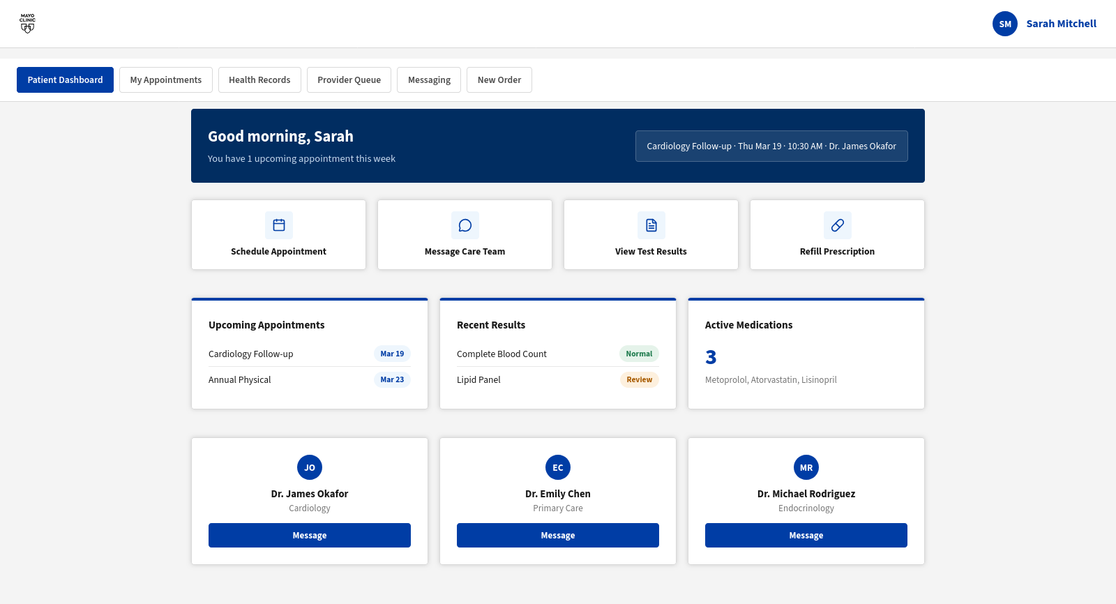
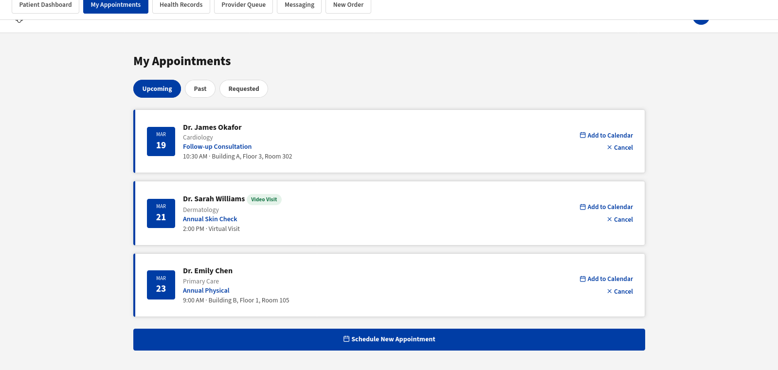
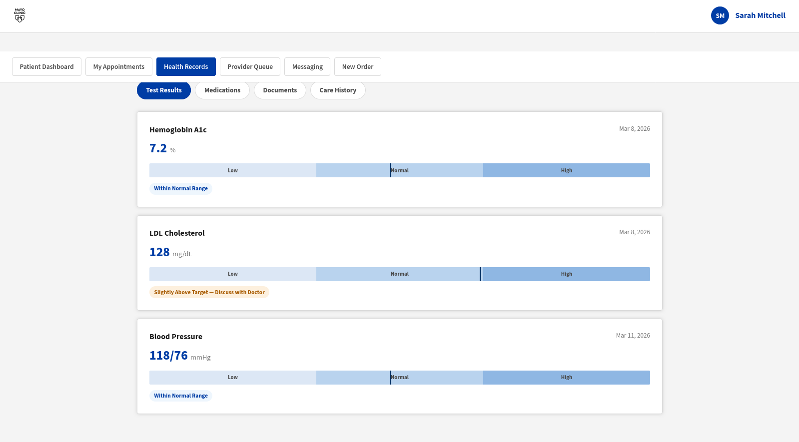
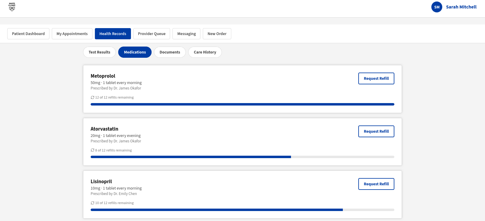
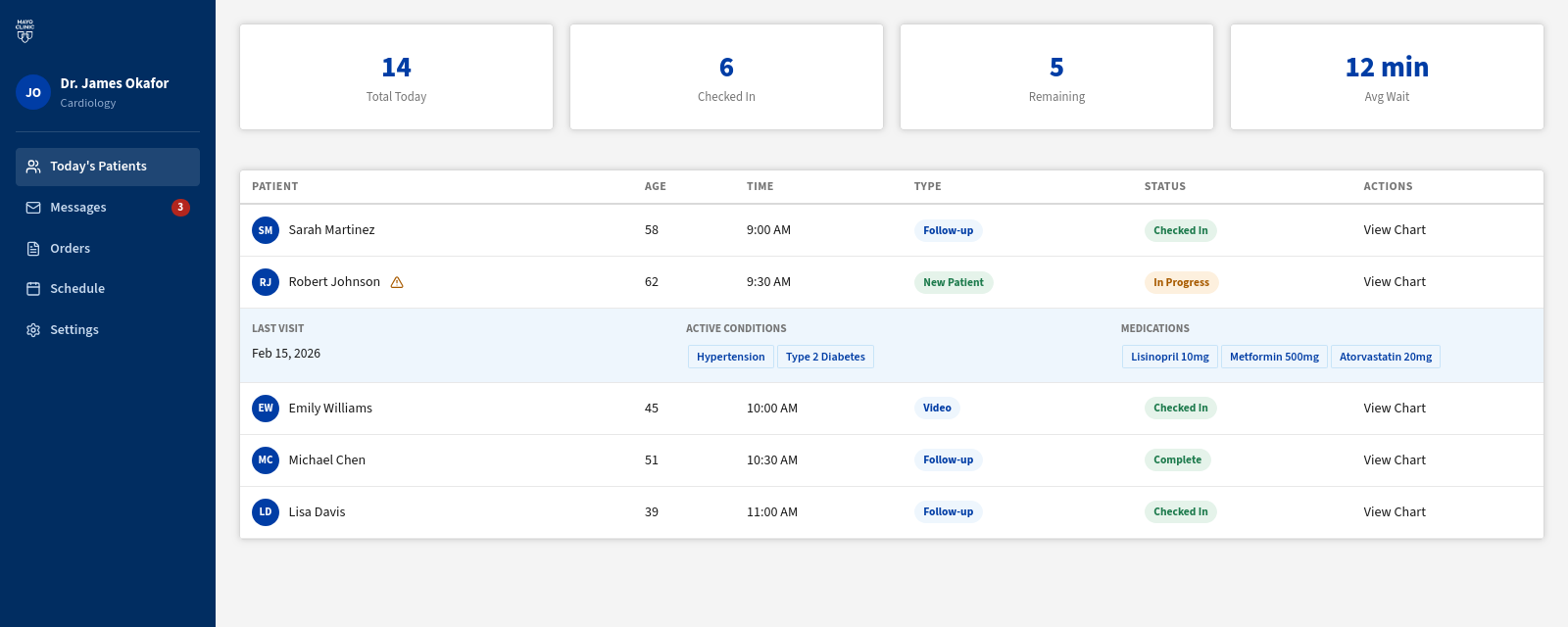
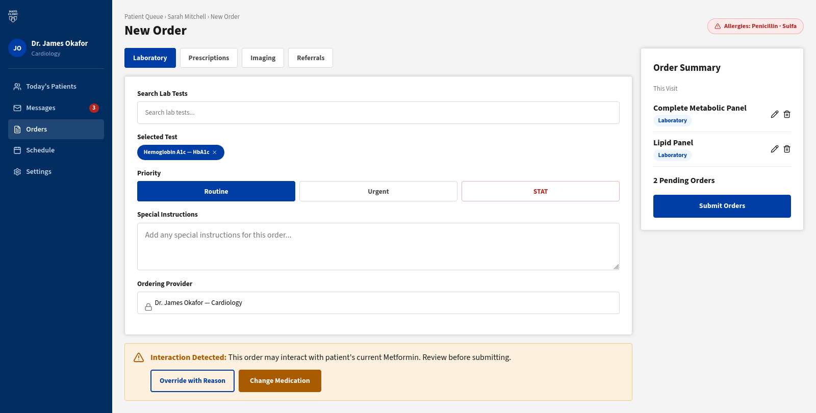
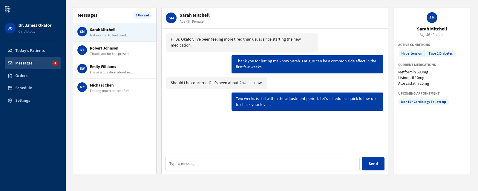
Telling someone a number is out of range without frightening them is three problems wearing one coat. There is the colour, since red reads as emergency in a clinical context and the warning state had to live in orange instead. There is the copy, because a raw value means nothing to most people and the plain-language line underneath is doing the real work. Then there is the hierarchy: the number cannot shout louder than what to do about it. Fixing any one of those tended to break the other two, which is why the abnormal lab result went round more times than anything else I designed here. What shipped carries status in position and shade and a written label at once, so it survives being read by someone who cannot see the colour at all.
In healthcare, accessibility isn’t a compliance checkbox. It’s a clinical obligation. A patient managing a chronic illness at 72 shouldn’t have to struggle with an interface designed for someone else.
No information conveyed by color alone. The test result range bar uses shape + shade + text labels so colorblind users get the full picture.
Every interactive element meets the 44×44pt minimum, critical for patients with motor impairments or mobile access.
All text meets WCAG AA contrast. Orange for warnings, never red. Red signals emergency in clinical contexts.
Visible focus rings on every interactive element. Tab order follows logical reading flow. Screen reader labels on all icons.
“Hemoglobin A1c: 7.2%” becomes “Slightly above target. Discuss with doctor.” Clinical accuracy preserved, comprehension barrier removed.
Red is reserved for true emergencies. Orange (#E8651A) communicates urgency throughout, without triggering panic responses.
My contract ran January to May 2025 and ended at handoff, so I was not there for the measurement. Rather than borrow the platform's numbers and let them read as mine, here is what is verifiable: the work that went out, and the standard it had to meet.
If the engagement had run past launch, these are the three I would have instrumented first, and why each one maps to a decision on this page.
A confusing error message in a consumer app is annoying. In a patient portal it can cause someone to miss a critical health action. Healthcare sharpened my instinct for clarity.
Contrast ratios and touch targets stopped being checklist items. When you’re designing for someone managing a chronic illness at 72, they become the most human decisions you make.
Physicians have extremely high standards for information accuracy and zero patience for design that prioritizes aesthetics over function. The best feedback I received came from a cardiologist with a red pen.